Client: Grand Candy
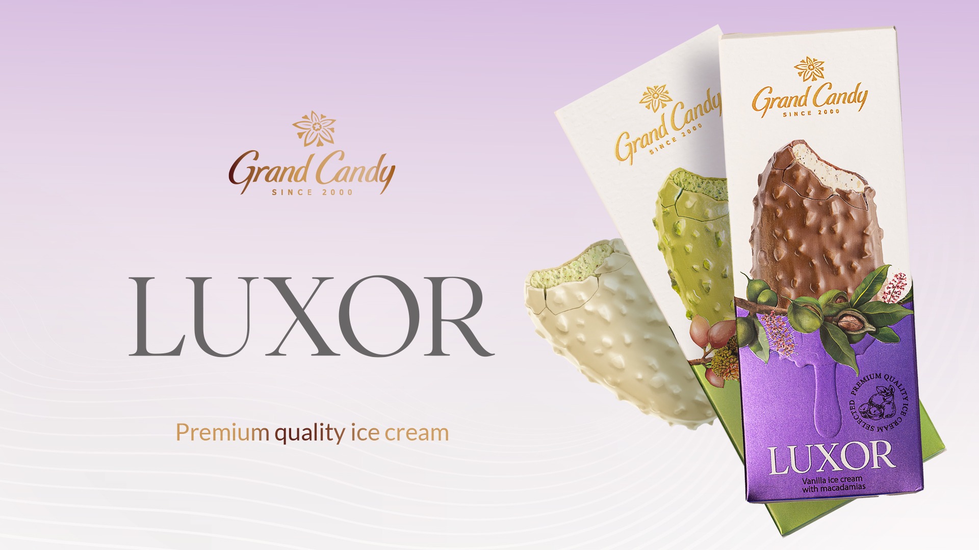
LUXOR is Grand Candy’s premium ice cream collection, crafted to celebrate rich flavors and refined indulgence. Our goal was to design packaging that feels as luxurious and memorable as the product itself.
Art Direction
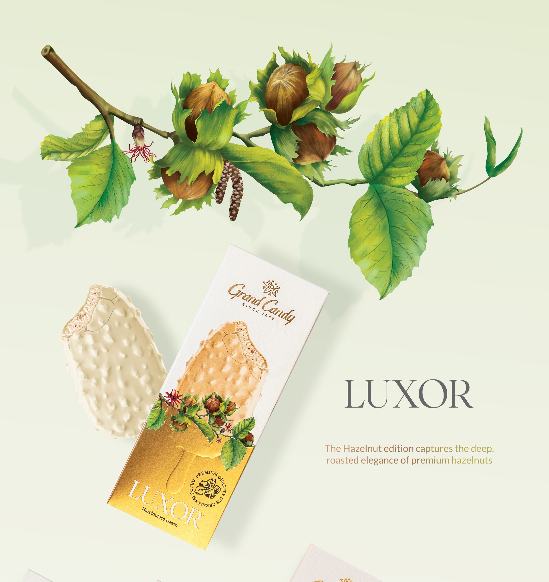
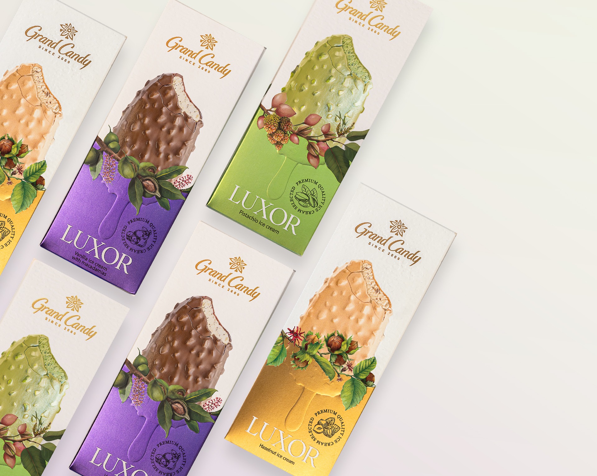
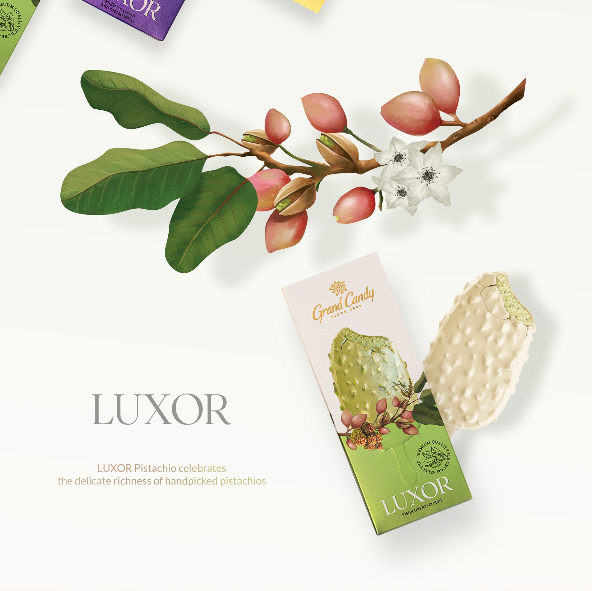
The visual identity draws from botanical elegance and timeless sophistication. Each flavor features custom hand-drawn botanical illustrations that reflect its key ingredients — pistachio, blackberry, vanilla, and more. These illustrations go beyond decoration; they tell a story of origin, taste, and sensory experience.
The visual identity draws from botanical elegance and timeless sophistication. Each flavor features custom hand-drawn botanical illustrations that reflect its key ingredients — pistachio, blackberry, vanilla, and more. These illustrations go beyond decoration; they tell a story of origin, taste, and sensory experience.
Print Techniques
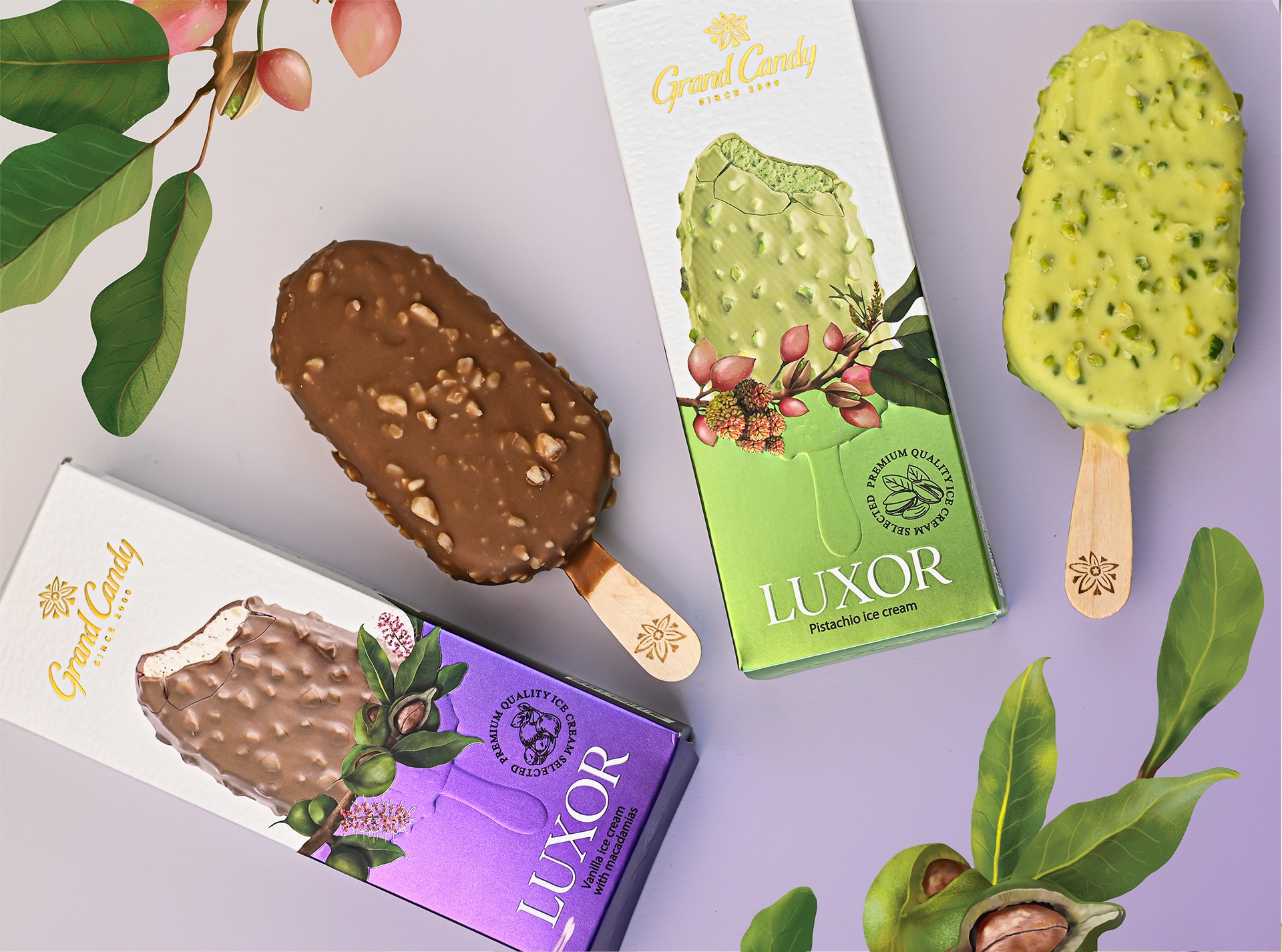
To elevate the tactile and visual feel of the packaging, we incorporated advanced print finishes: Embossing to add dimensionality to the ice cream textures
To elevate the tactile and visual feel of the packaging, we incorporated advanced print finishes: Embossing to add dimensionality to the ice cream textures
Spot UV varnish for highlighting the logo and illustration details
Pantone colors paper to distinguish each flavor and add a layer of richness
Brand Voice
The name LUXOR evokes a sense of royalty and delight. The combination of elegant typography, minimal layout, and premium materials transforms the packaging into an experience — one that begins even before the first bite.
The name LUXOR evokes a sense of royalty and delight. The combination of elegant typography, minimal layout, and premium materials transforms the packaging into an experience — one that begins even before the first bite.